My colleague, Natasha, created a spiral novelty Christmas tree from card, I think it's a much better oversized pencil sharpening! thanks Tash!
Thursday, 5 November 2009
Wednesday, 28 October 2009
Pride & Prejudice, book cover
This is the newest project I've been working on. I was asked to visualise the cover of Pride and Prejudice to appeal to 14 year old boys, hmmm. That was definitely a challenge!
The concept I came up with was to have the book made as a graphic novel as within my research I found they responded to this format better than a book full of difficult victorian text.
The cover is showing Darcy peering through the rain. Boys seem to respond better to male characters (maybe inspiration for them!) so instead of depicting Elizabeth Bennett and her heaving bosom I showed Darcy looking moody and merciless.
The typography is using FourScore which is a beautiful handwritten font. I've introduced an ink wash throughout the graphic Darcy and type to really set the mind to the age. I didn't want to lie about the contents of this book as it's very romantic but I also didn't want to repel the young men. I think this makes it quite intriguing.
Thursday, 22 October 2009
Good Food, Good Logo
I was really taken with this logo as I saw it at the bottom of the page. It took me a few minutes to realise it was a tomato/orange! The simple concepts sometimes have the highest impact. well done guys! however I'm not wholly impressed with their 20 year anniversary logo. I love the cupcake concept, but I'm sure someone could have introduced a better font?
Wednesday, 21 October 2009
logos logos logos
This is my first idea for Kitson Solicitors who are branding themselves as new breed solicitors, young and dynamic. I represented the feeling by introducing an emblem, the phoenix. This is to show how these guys are rising from the ashes, reinvented, young and bright.
There was a lot of deliberation about how the phoenix should look (it being mythical and all) so I did my best to make it a more masculine emblem and not look like a glorified chicken. I think it turned out ok.
Wednesday, 7 October 2009
Final Masterstroke Logos
These are the two final logos I went with. I created them using retro 50s fonts and colours that were used throughout Ping's 1950s advertising campaigns. I think on a whole they conjure up the vision of a subtle but strong logo for the elite.
Friday, 2 October 2009
Wedding Wood Carving
This is a wood carving i created for my friends wedding (a year ago, i know, i know!) They will eventually receive it in all it's glory. It took me ages so I'd like to make it as good as I possibly can possibly with a varnish to bring out the background pattern. For a first attempt I'm quite pleased!
Road art
Wednesday, 23 September 2009
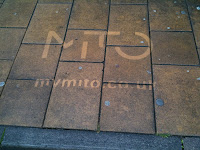
Clean me
Found this outside the bus stop on South Street in Exeter, fortunately a someone at work was able to photograph this as my camera ran out of battery! Thanks Giles! It was quite the talk of the office, although I've seen quite a lot of this type of advertising in photos across the internet I've never seen in Exeter.
Curb, the Natural Media Company http://www.mindthecurb.com/what-we-do-snow.asp is at the forefront of some amazing natural graffiti/advertising and I look forward to seeing more of this type of advertising as it's natural, beautiful and exciting!
If you see anything of this kind in your town I would love to you to mail it to me.
Sky Fish
Well I thought I'd run out of things to write about quite quickly, however a seagull dropped this live fish over my shoulder this morning, and landed with quite a wet, fishy sort of sound! I was quite shocked but camera ready!
Poor thing flapped a bit but then the seagull came back for it and took it away (much to my relief!). But it came back with a huge chunk of flesh and happily ate it by my side. Thanks Seagull, I shall name you Mariner!
Tuesday, 22 September 2009
Creative type
Monday, 21 September 2009
Wedding invitation for friends
Church work
This is lovely wraught iron work on a chapel in Exeter. Intricate and delicate is always so beautiful in such a strong heavy material. love it!
Stamp Electrical branding
This is some branding for a friends electrical business. He wanted to use his font, Hang the DJ (available from 1001 free fonts, I think!) so I had to build something that would not look out of place on the electrician market. It was quite difficult to work in the font but with adding a calmer, clearer font (din) for the secondary text it seems to be working well. He's pleased and can see that the branding will work over more than just t-shirts and business cards. Thanks Ollie!
Beautiful Fascia Board
Subscribe to:
Posts (Atom)